


VCOM 2950 Visual Communication Applications
Sections 001, 002 — Spring 2025
Instructor: Phil Loubere
Illustrator Project Results
The goal was to create a design that achieves a unified appearance, that is, viewers see the entire design before the individual parts, primarily by using the gestalt principles of proximity, similarity, continuation, closure, and figure/ground.
Proximity: Usually the most successful designs for this project are those that use groups of shapes which combine together to suggest objects and patterns. Conversely, single shapes that are isolated from each other do not come together as well to unify the design. A simple way to achieve this is to have shapes overlap.
Similarity: Shapes that look alike tend to be perceived as a group. This is achieved through the contour and the color of the shapes.
Continuation: When shapes are arranged along implied paths, that creates a sense of movement. Diagonals and curves are generally more dynamic and add energy and interest to the design than horizontal or vertical paths.
Closure: As we look for patterns, we tend to fill in gaps between shapes in order to complete what we think the pattern suggests.
Figure/Ground: Every area in our chosen frame is part of the design, including areas where we haven’t placed any shapes.
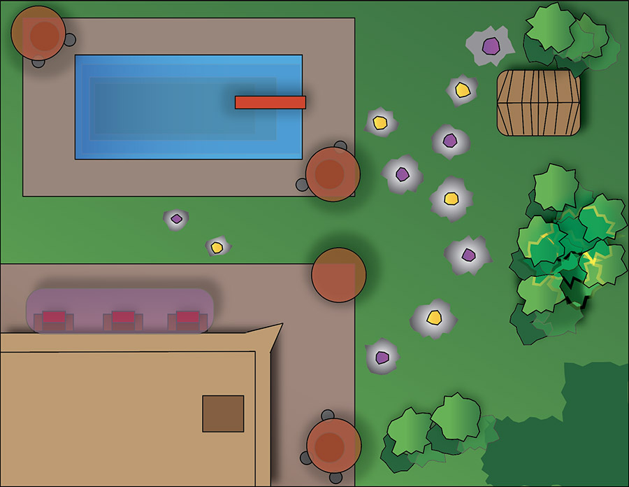
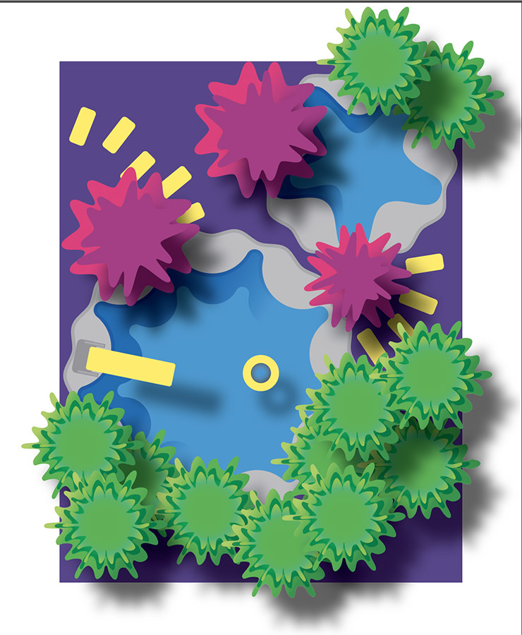
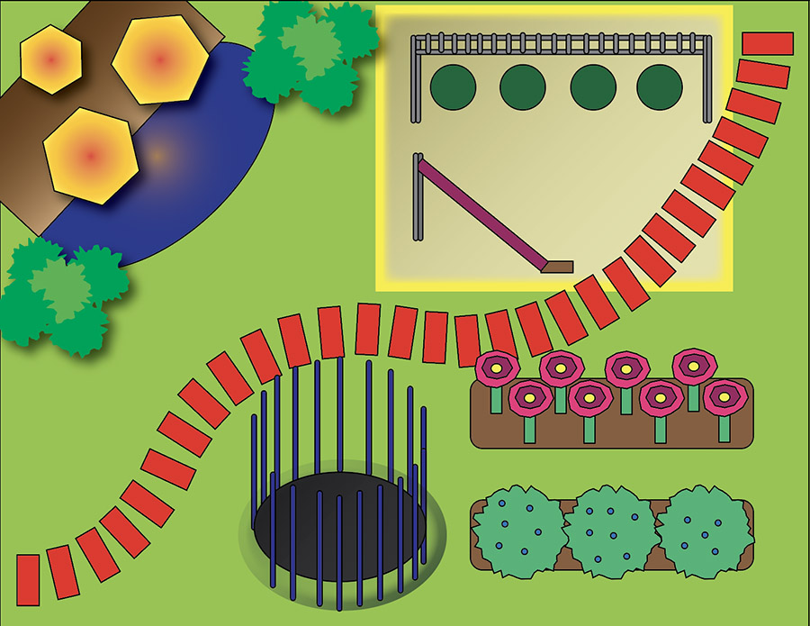
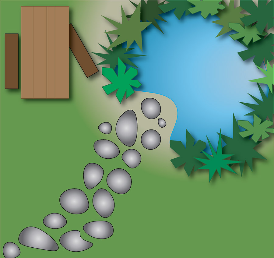
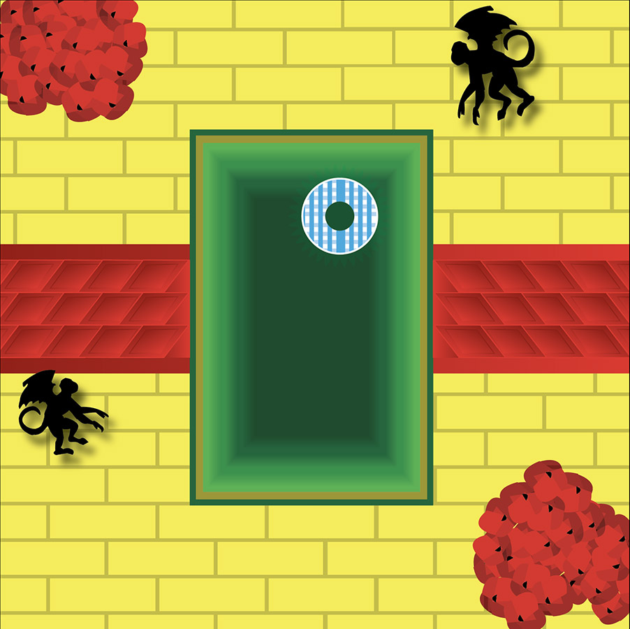
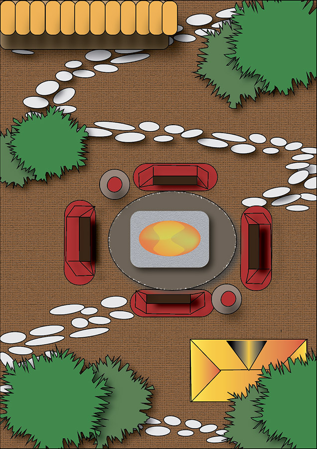
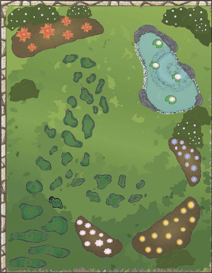
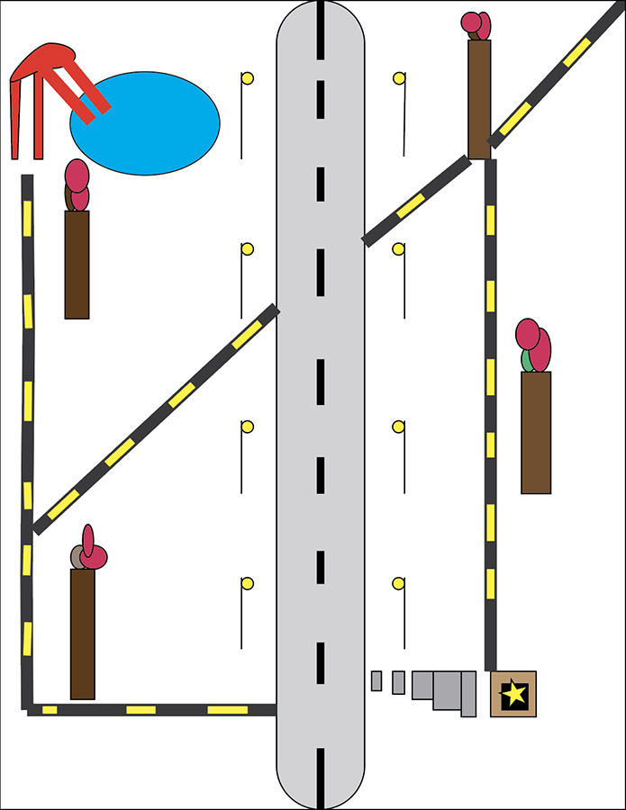
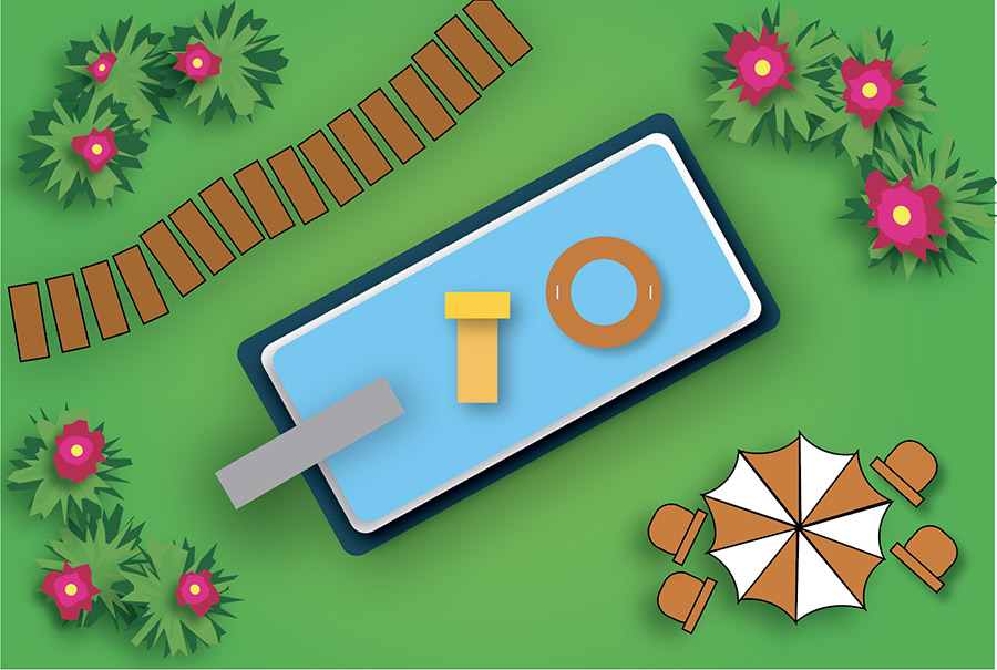
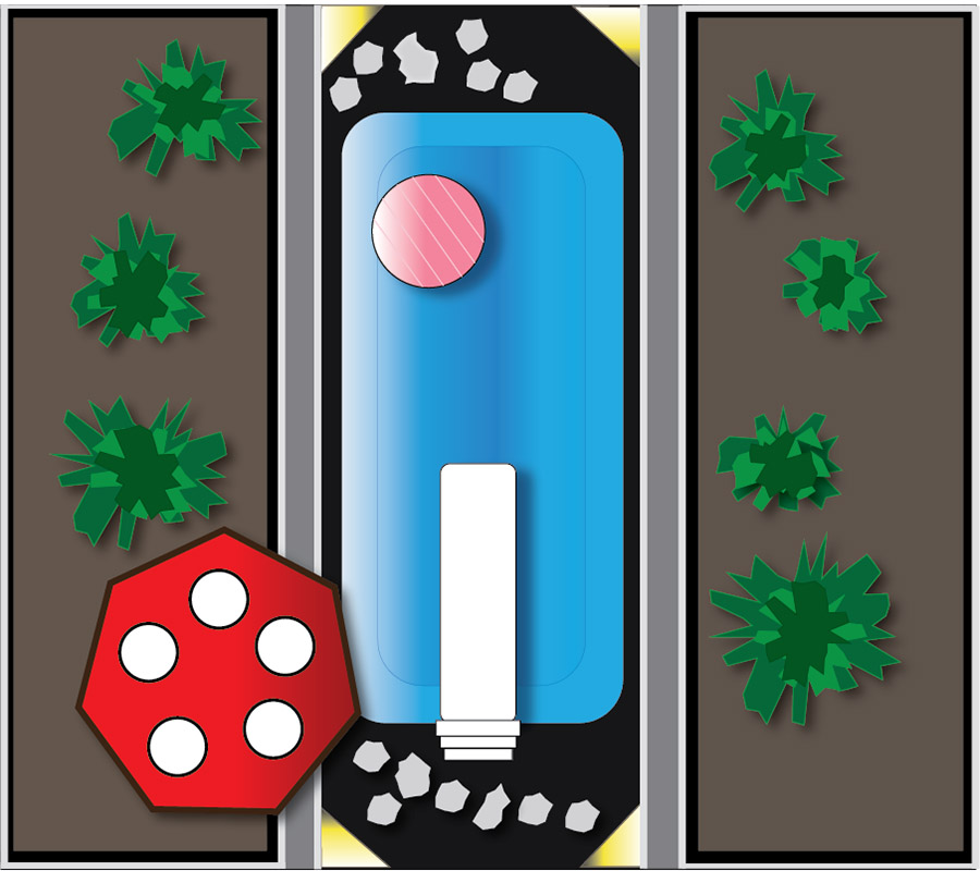
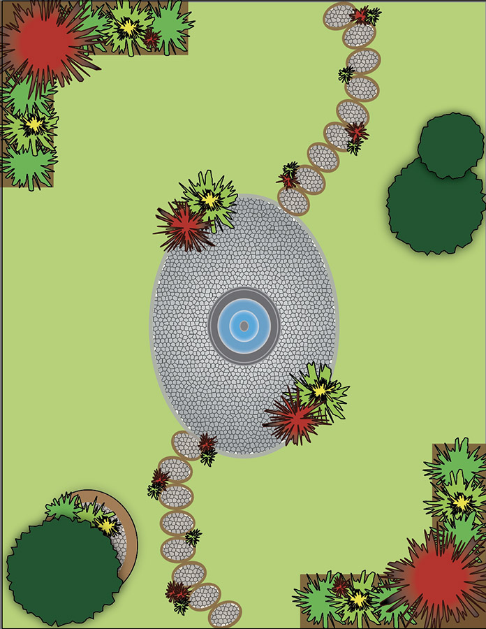
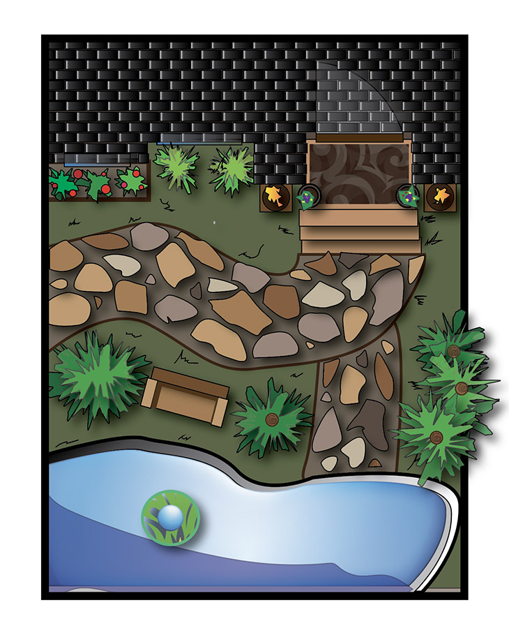
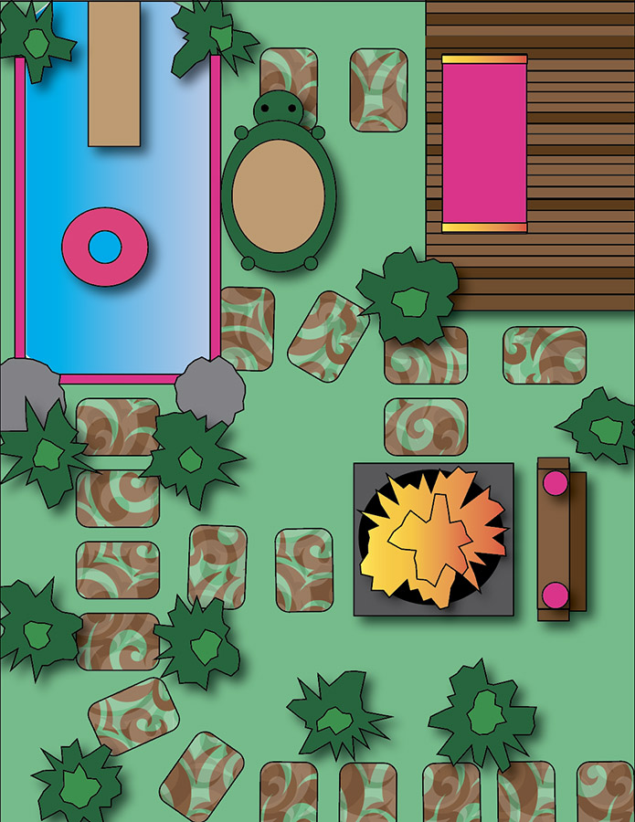
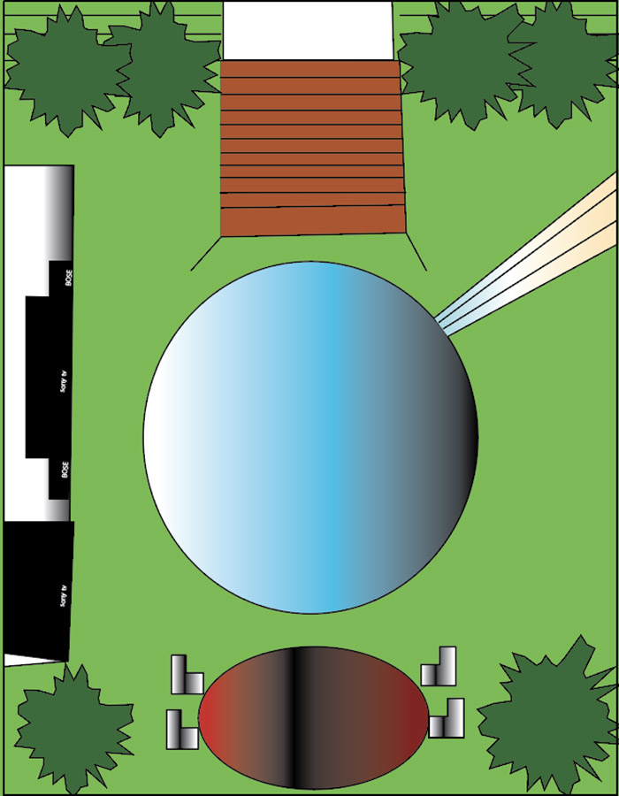
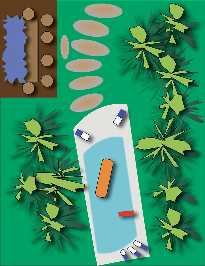
Here are everyone’s project submissions. Click on the thumbnails to enlarge them:
Section 001

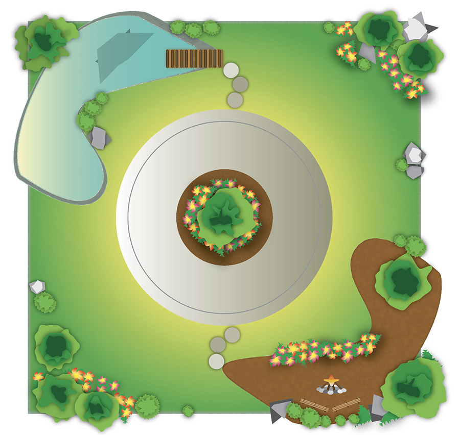
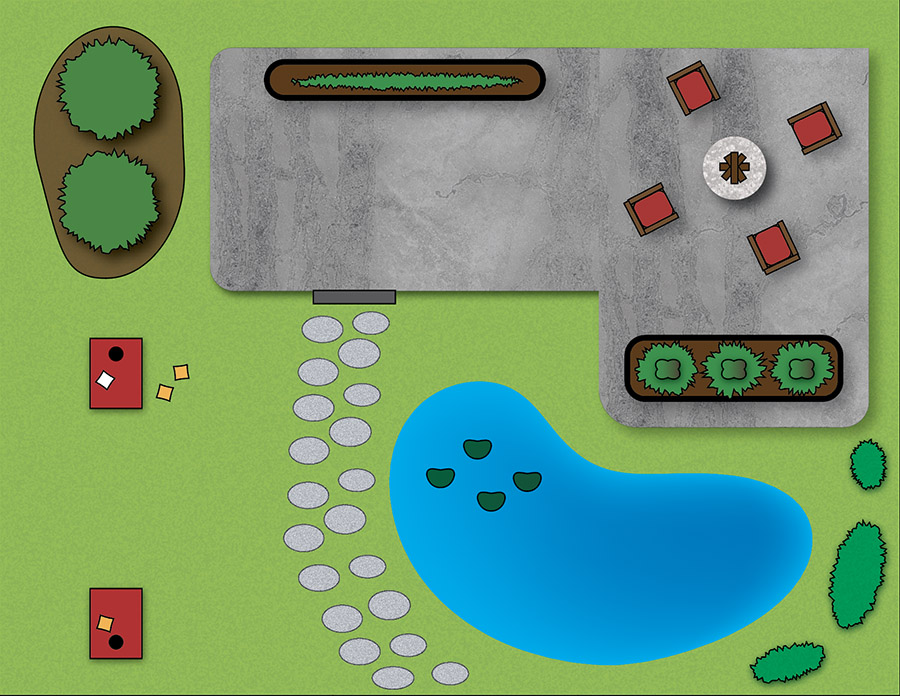


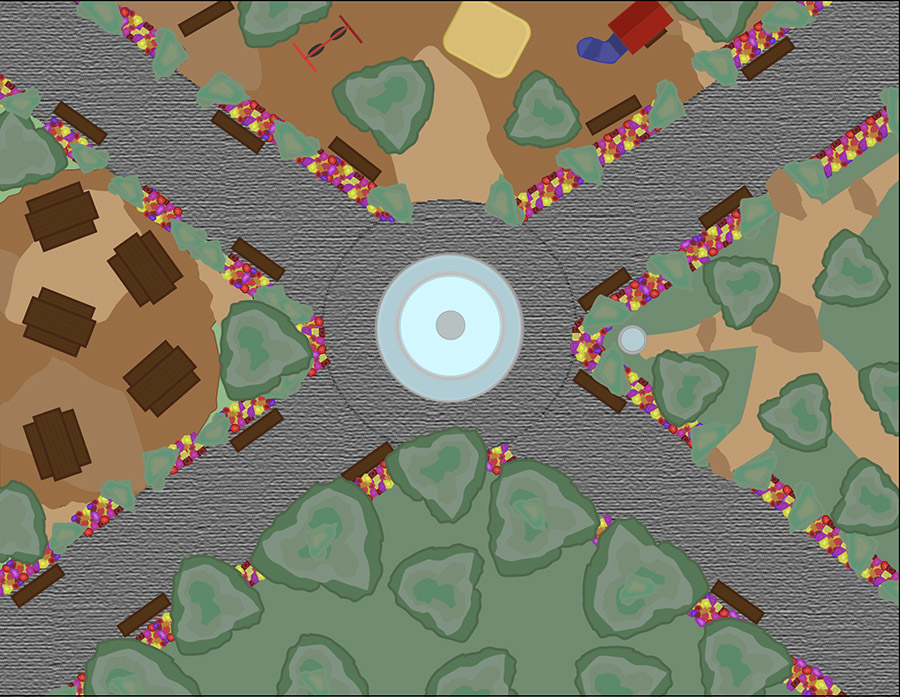
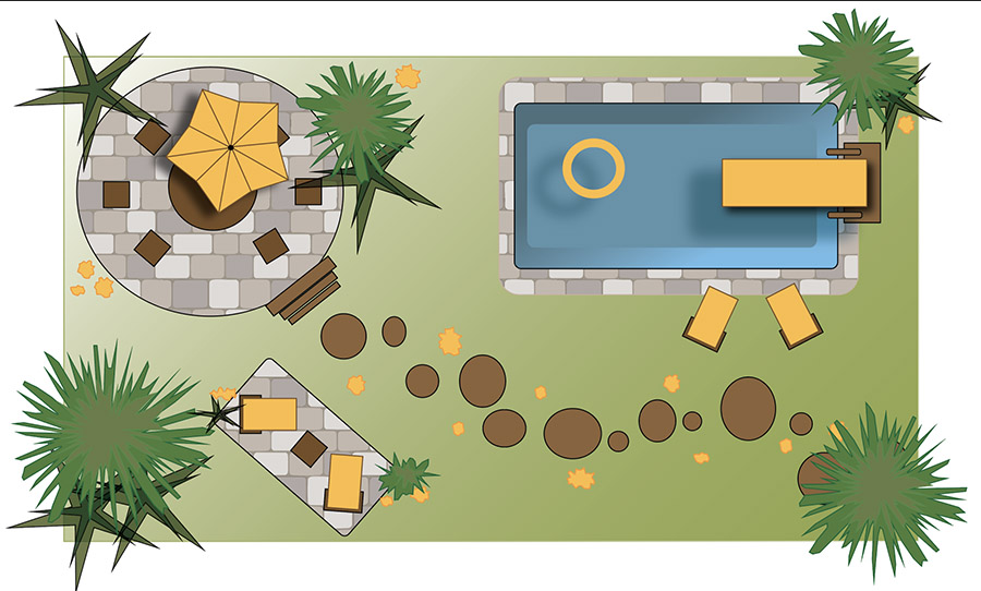
Section 002


Evaluation criteria:
1. Proximity: Are there groups and clusters of overlapping shapes? If they’re all set apart from each other, they’re less likely to come together into a unified image.
2. Similarity: Do shapes and areas share common colors, textures and contours? This will also contribute to unity.
3. Are there different parts or areas of your design that don't have much in common? Try using similar shapes and colors to tie them together.
4. Continuation and closure: Is there some implied motion through the use of diagonals and/or curves? That will add more interest to your design.
5. Figure/Ground: Is there a lot of background compared to the amount of foreground shapes? That will probably result in the foreground shapes being isolated from each other.
6. What is the dominant thing? Is it what you want people to see first? Are your background colors as intense or more intense than the colors of the foreground shapes? That makes it harder for the foreground shapes to be dominant.
7. Is there a good range of values, that is, lighter and darker areas? If not, the overall image will appear flat and dull.
8. Is there enough variety to add interest? If things are arranged in predictable rows and grids, that’s not very interesting.
9. Is the color palette balanced and harmonious? That is, do the colors work well together and provide the right level of contrast, and contribute to a sense of unity?
10. What is the most interesting thing going on in your design? If it’s not the dominant or central part, maybe consider making it that.
Some general suggestions:
Many of the designs have shapes isolated from each other, without much to tie them together. Also, there is a fair amount of predictable repetition, and not a lot of implied motion, that is, not a lot of diagonals or curves. The most successful designs are those in which you don’t immediately notice individual shapes. If you have shapes such as trees standing alone and surrounded by empty areas, then you’re probably not achieving unity, or capturing much interest.
You might have found it too much work to add things. Here are a few tips to make it easier:
• If you hold down the Option key (Mac) or Alt (Windows) when dragging a shape or group of shapes, it will make a copy of them. You can then rotate and or resize the copies to add a little variety.
• Pressing Command d (Mac) or Control d (Windows) will repeat the last thing you did. For example, if you Option-dragged a shape to copy it, pressing Command/Control d will make another copy, at the same distance that you dragged the first one.
• If you make a copy of a shape to which an effect has been applied, such as Roughen, you can edit the copy’s effects in the Properties panel (find it under the Window menu):
- Select the shape and the panel will list any effects.
- Click on the effect in the panel and a dialog box will open that will allow you to modify it. You can also delete the effect by dragging it to the little trash can at the bottom of the panel.
• Under the Object menu is a list of Transform options that can also be used to modify shapes. If you select a group of shapes (hold down the Shift key to select more than one shape, or drag the Black Arrow over a group to select them all), then the Transform Each command will allow you to change them all at the same time, such as scaling or rotating them.
• You can easily select every shape that shares the same characteristics such as stroke or fill color. Select one shape, and then go to the Select menu: Same. Then you can change them all at the same time, such as changing their fill color.
• If you place common items on the same layer, it also makes it easier to select them all. For example, if you make a new layer (Layer panel - popup menu in upper right corner - New Layer) and place all your bushes on that layer, you can select everything on that layer by clicking on the far right edge of the layer in the Layers panel.
• You can lock or hide selected shapes under the Object menu. Unlock or show them there too. You can lock or hide layers in the layer panel by clicking on or off the icons on the left side of each layer in the Layers panel.
• Remember to use the Paste in Front and Paste in Back commands under the Edit menu to move shapes in front and in back of each other.
- Select the shape to move
- Edit - Cut
- Select the shape you want it in front of or in back of
- Edit - Paste in Front or Paste in Back.
Also, don’t forget that one of the project requirements is to use a different blending mode on at least one shape. How to do this is explained in the project page, in the videos, and in the Illustrator short manual:
Illustrator manual
Hopefully it’s helpful to look at each other’s work, and to take another look at the examples on the project page:
AIproject.html
You have the opportunity to turn in a second version to improve your points for this project. The due date is listed in the D2L Illustrator Project Resubmit dropbox.