


VCOM 2950 Visual Communication Applications
Instructor: Phil Loubere
Illustrator Project
By now you should be comfortable using Illustrator to create shapes, change their fill and stroke colors, and arrange the shapes in front of and in back of each other. This project will allow you to use those skills to create a somewhat abstract design, one that won’t be traced from a template. We’ll also cover some new things you can do in Illustrator: effects, textures, blending modes, and working with layers.
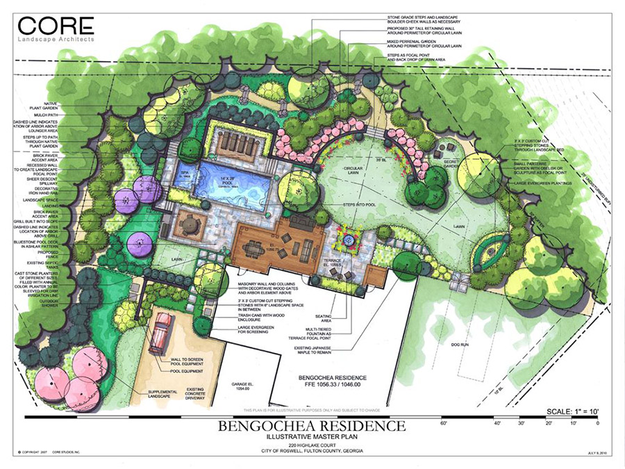
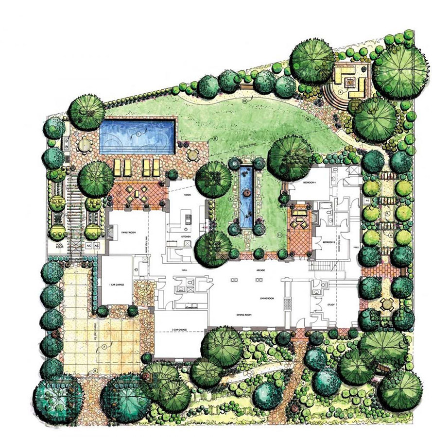
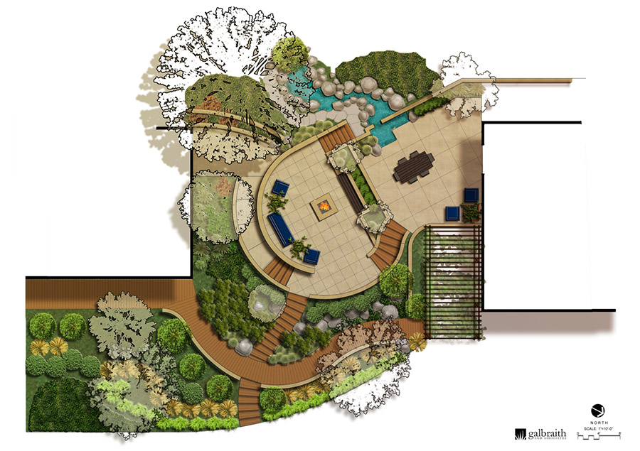
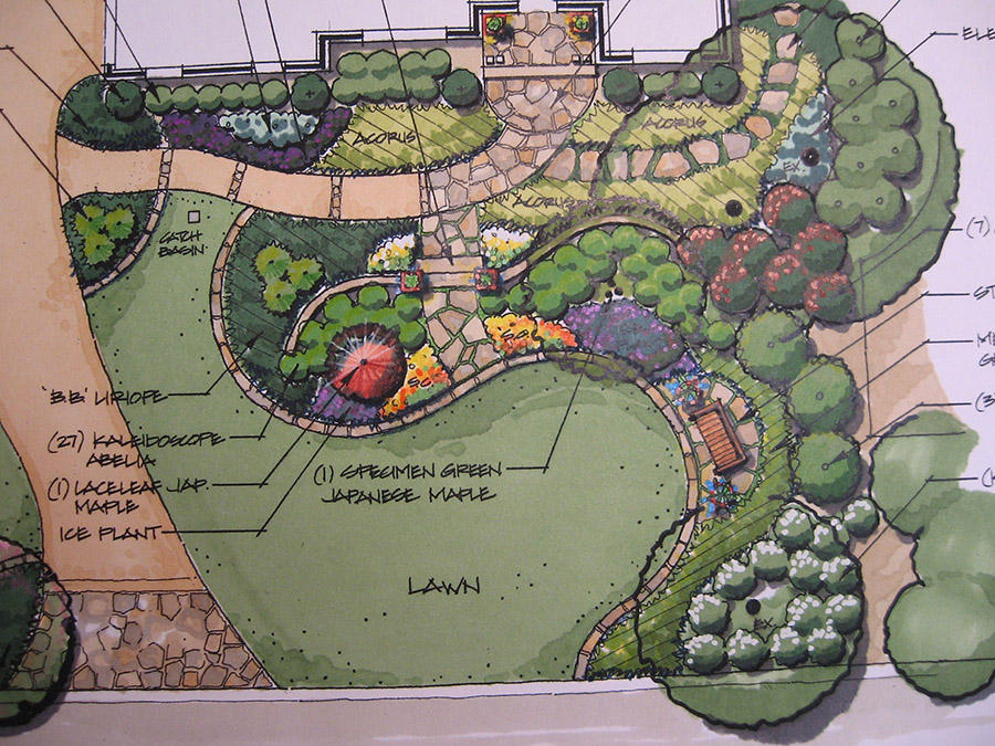
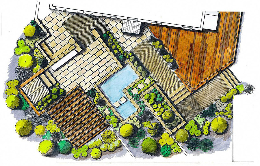
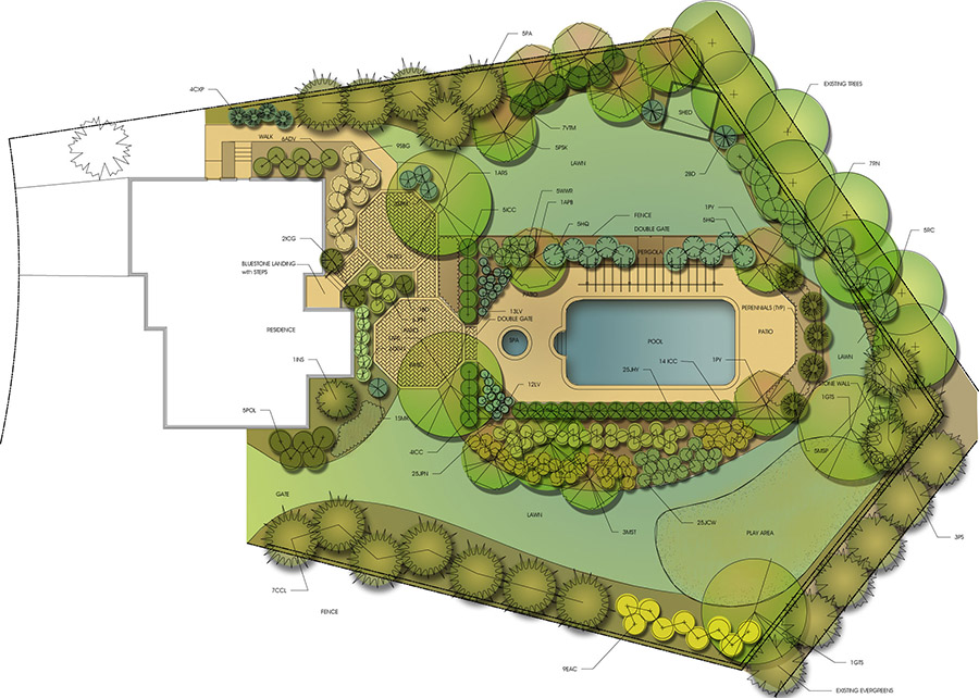
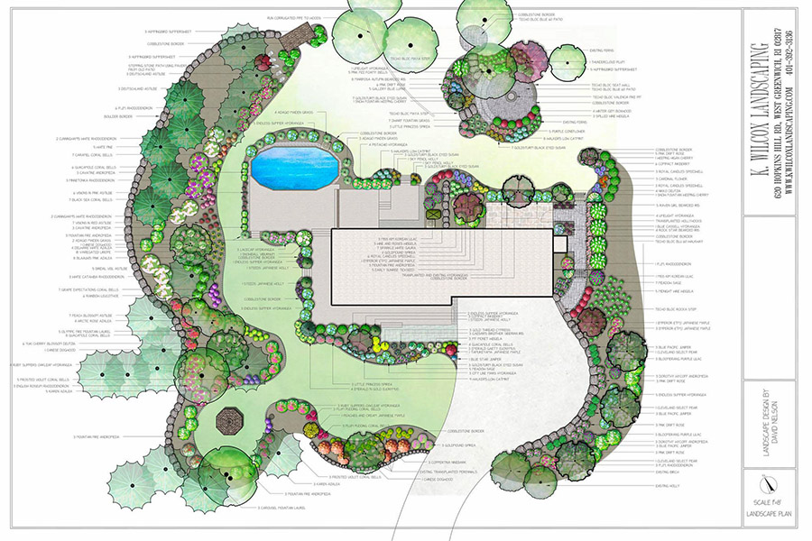
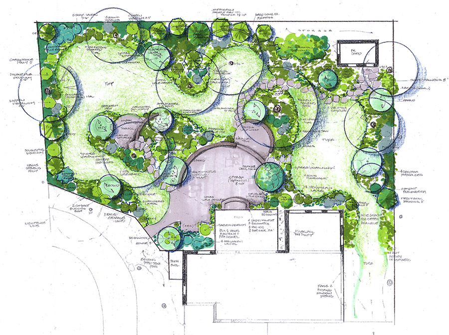
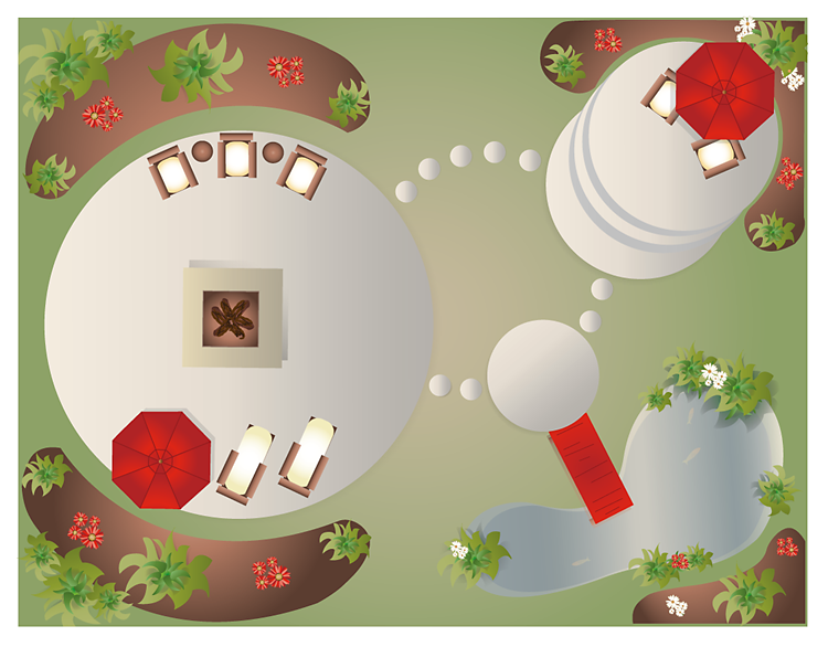
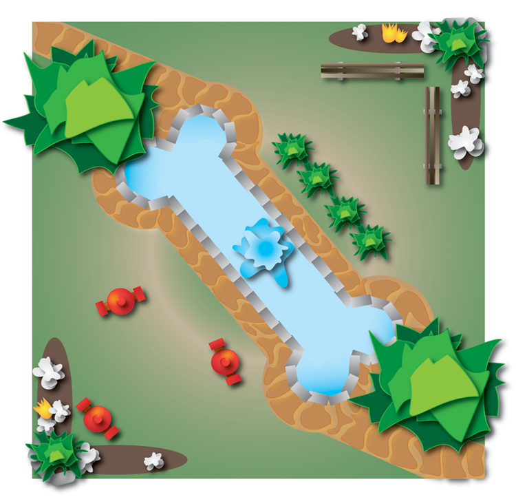
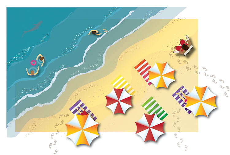
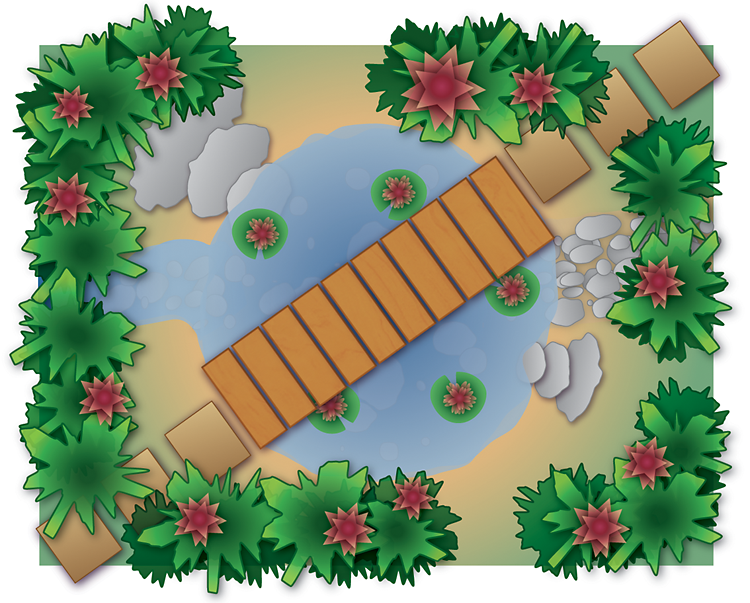
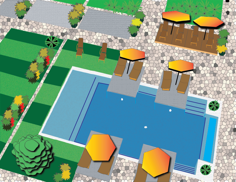
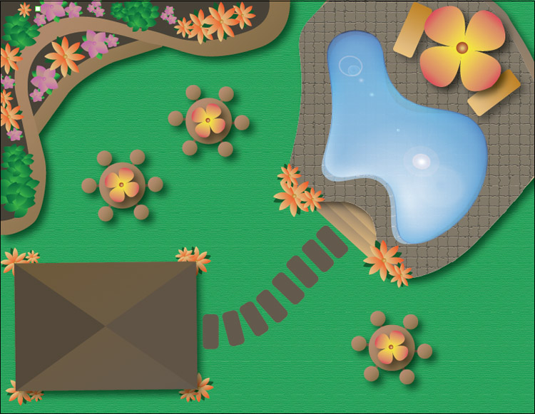
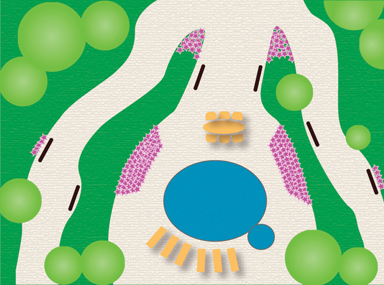
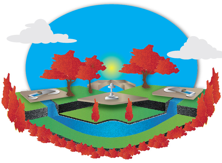
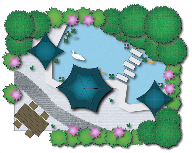
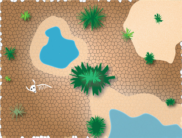
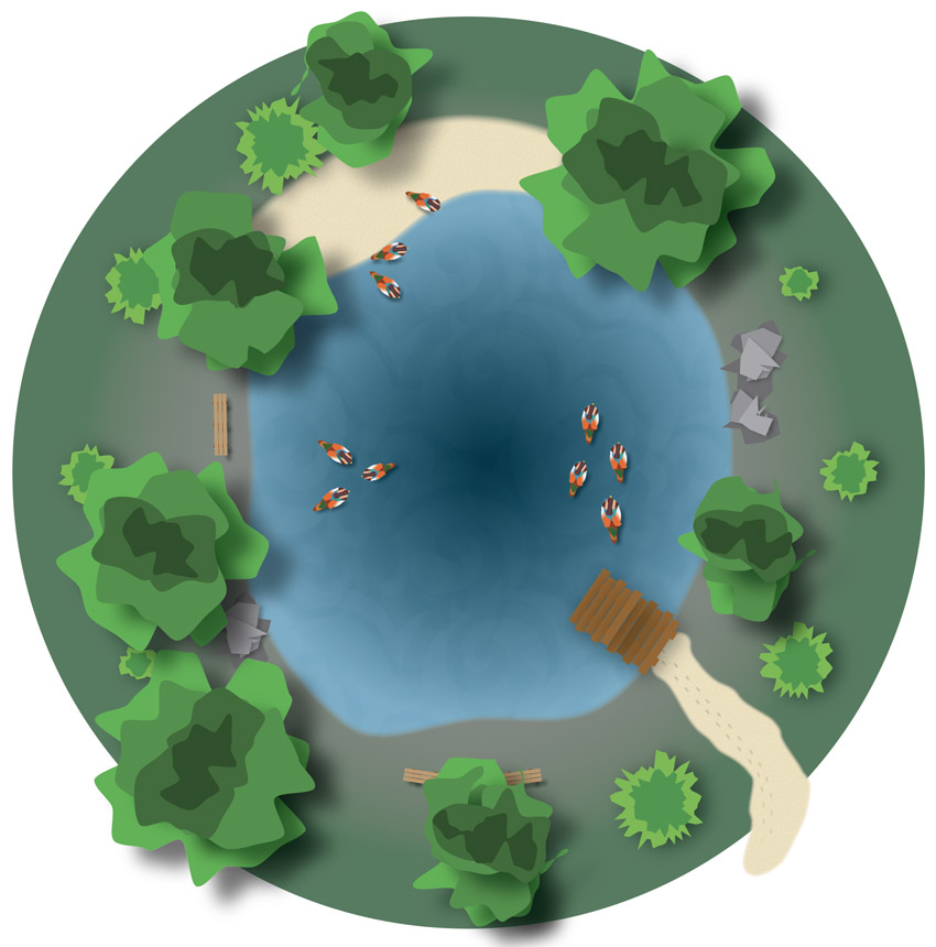
This project is based on a common type of illustration done by landscape architects, in which they map out a property with symbols representing different elements such as trees, bushes, walkways, ponds, and the like. Here are a few examples. While they were done with traditional artists’ materials, they are attractive forms of artwork in their own right:
In this project, you will assume the role of a landscape architect and design an imaginary space of your choice, a park or a yard, for example, and create your design in Illustrator.
The project is intended to give you the opportunity to experiment with the design principles that we’ve covered. You will be making a fairly abstract design, in which you will invent symbolic shapes, and try to arrange them according to those principles to make a cohesive, unified design. Keep in mind that the goal is to make an interesting design and to not be concerned with practical considerations about the feasibility and useability of your space.
Here is a PDF with specific project instructions. There are no materials that need to be downloaded:
Illustrator project instructions-PDF
The first video below goes over the design principles again. The next one shows an example of how to do the project. The last two offer some technical information on how to work with Illustrator. Total video time is about 30 minutes.
Project Specifics
The premise of the assignment is just a framework to get you started. The goal is not to make a useable space but to make a successful abstract design. So don't worry about practical considerations with the placement of things, or making colors representational (grass doesn't always have to be green). Focus on the design principles.
The frame doesn’t have to be square or rectangular, it can be any shape of your choosing. Within it you will create shapes to represent different things in the space: trees, bushes, sidewalks, patios, furniture, animals, people, etc. The shapes should be more symbolic than realistically representational.
Then use the design principles to arrange the shapes in a way that creates a cohesive unity, where viewers see the overall design before the individual parts:
• Gestalt: Proximity, similarity, continuation
• Design principles: Repetition vs variety, dominance, symmetrical or asymmetrical balance, figure/ground, economy
• Colors: A consistent palette with appropriate contrast, maybe a split-complement, with a good range of light-to-dark values.
The Illustrator document should be in CMYK color space.
Make sure to use a different blending mode on at least one shape.
Don’t overdo too many effects, it will make your document size increase exponentially and become unwieldy.
Submit a native Illustrator document, with a .ai suffix. No need for a publication package.
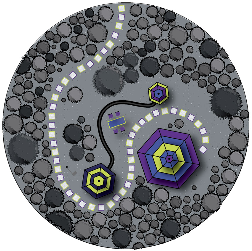
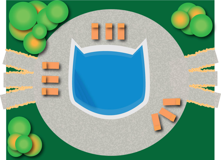
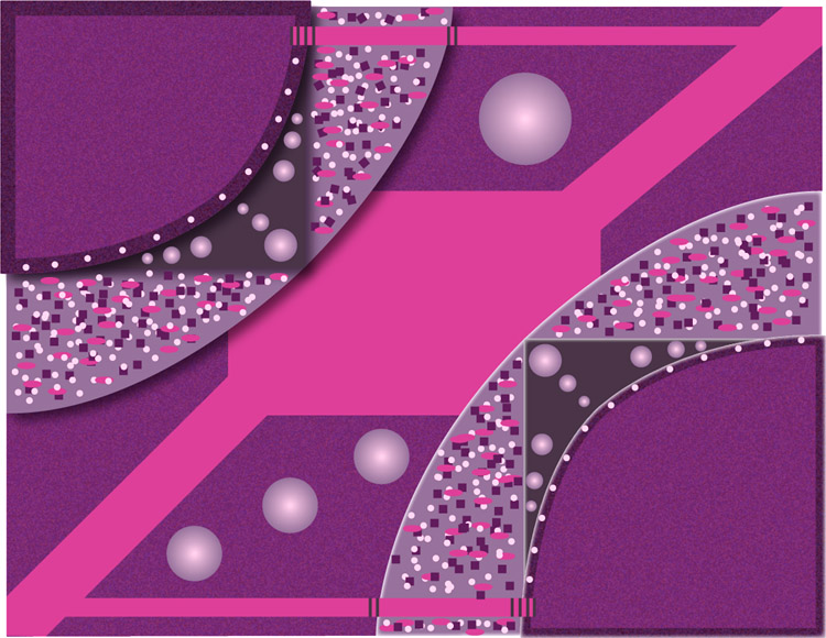
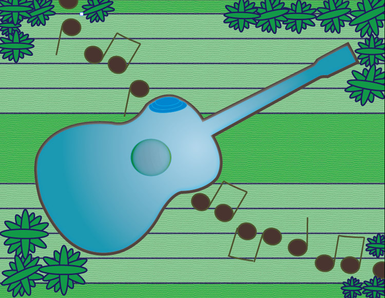
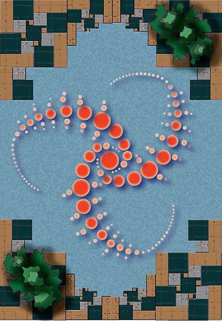
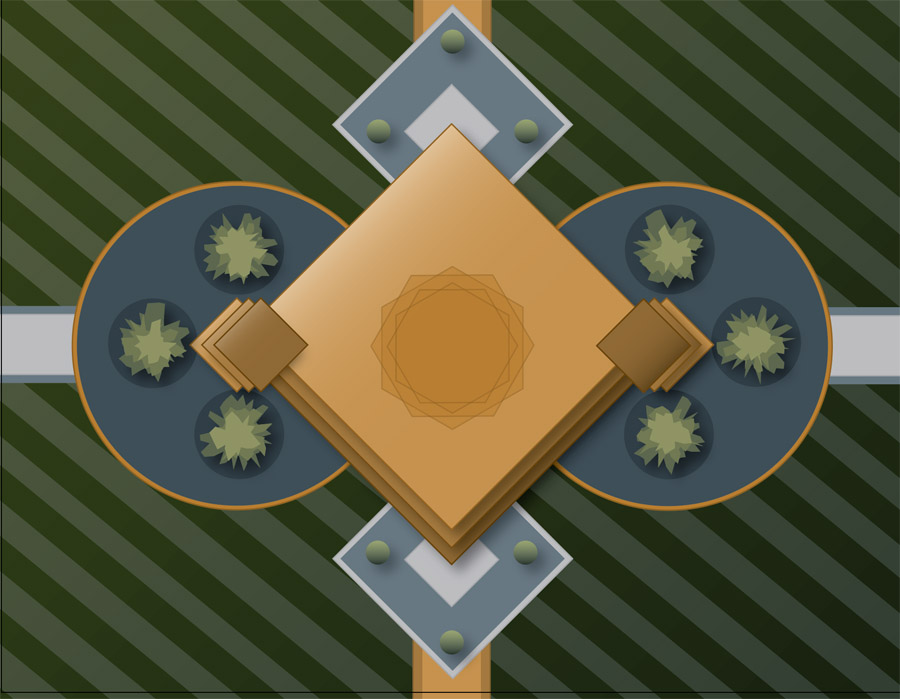
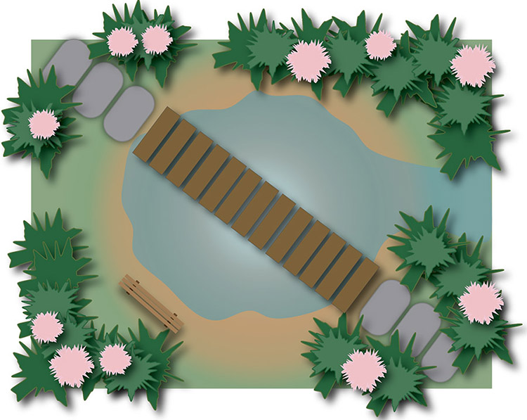
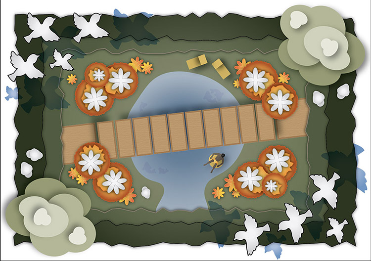
Examples
Here are some examples of student work from previous semesters.
Some new things in Illustrator
One of the project requirements is to use a different blending mode on at least one shape in your design. Here's what that means.
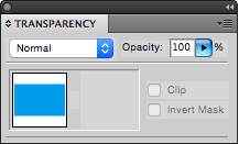
Blending Modes: You can change the blending mode of any shape, which makes it interact in different ways with any shapes that are behind it. Blending modes are applied to a selected shape through the Transparency Panel. Where it says 'Normal' is a popup menu listing all the blending modes. Here's an example.
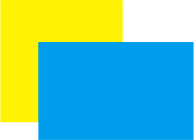
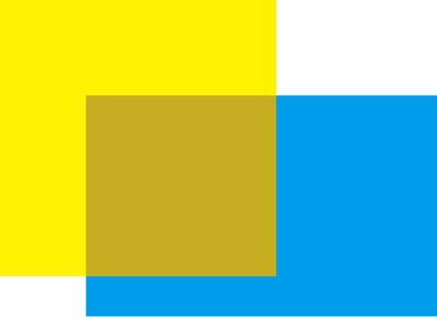
In Illustrator, two shapes are drawn, one with a 100 percent yellow fill and another one 100 percent cyan. The default blending mode for both shapes is 'Normal'.
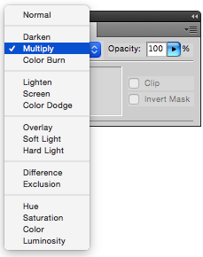
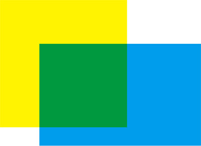
The cyan shape is selected, and its blending mode is changed to 'Multiply'. The cyan mixes with the yellow behind it to make green.
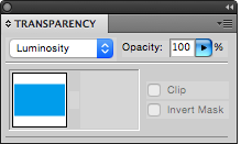
Now the cyan shape, still selected, has its blending mode changed to 'Luminosity'.
Each blending mode does something different, depending on the shapes. Try experimenting with them. You can also change the opacity of a selected shape here.
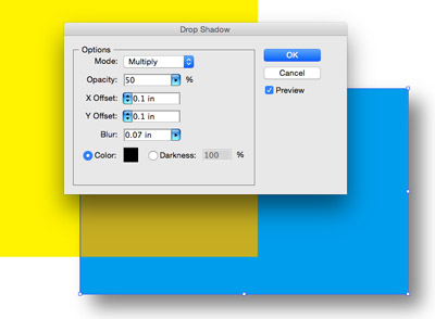
Effect menu
There are a lot of options here to create effects and to apply textures. You can see how some of them were used in the student examples above. A couple that might be useful:
Drop shadow: This is under 'Stylize'. The cyan shape is selected.
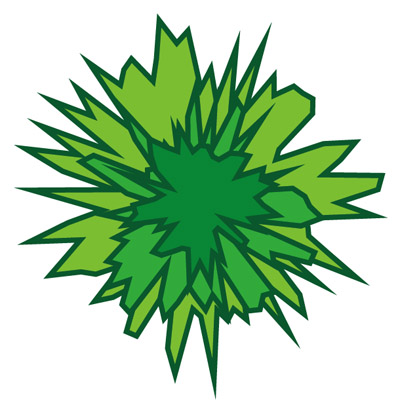
Roughen: This is a quick way to make bushes and vegetation shapes. The filter is under Effect > Distort & Transform > Roughen . . .
Draw a circle first, and then, with the circle selected, apply the filter.
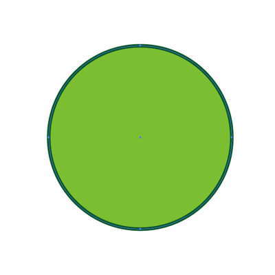
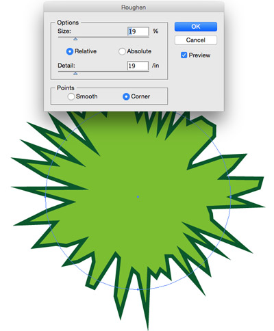
Stacking a few roughened circles in front of each other is a quick way to make vegetation. You can see how it was used in some of the student examples.
Project files
Here is a link to download a PDF explaining how to make a swimming pool:
swimming_pool_instructions-AI.pdf
Color palettes
One of the challenges of this project is to find a few colors that work well together to form a color palette for your design. Try to choose three or four colors and use them consistently across your design.
Here are links to online tools that can help you to generate a color palette:
http://paletton.com
https://color.adobe.com/create/color-wheel
https://color.adobe.com/create/image