VCOM 2950 Visual Communication Applications
Instructor: Phil Loubere
Design Principles
This PDF covers the theories and principles relevant to the class projects:
vcom.design_principles.pdf
These videos will cover the principles we'll be using to create effective design in our projects.
Total time for the videos is about 18 minutes.
Design Principles
In class, I usually start this lecture by asking if anyone knows what the word 'design' means. Although everybody knows the word, few people can come up with a concise definition.
The dictionary definition is usually something along the lines of conceiving or executing a plan, or to draw or layout something. For our purposes, let's think of it as:
The purposeful arrangement of elements in a given medium.
The purposeful part indicates that there is a goal in mind. So, the decisions in how elements are arranged are guided by a desired outcome. The act of designing can apply to any creative activity, from drawing to interior design to mechanical engineering, for the purpose of making something useful and of value.
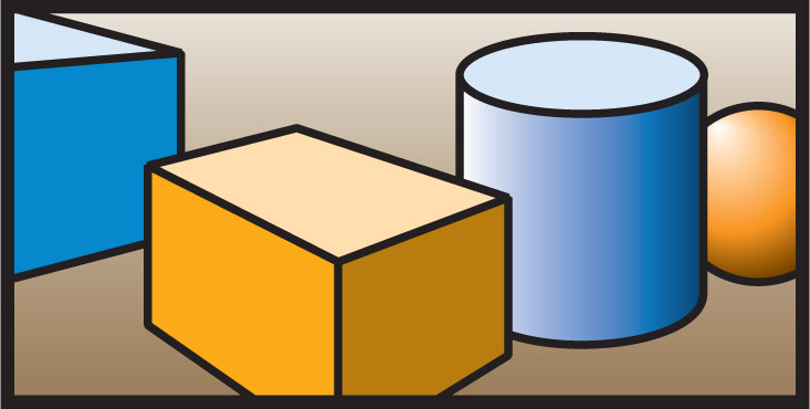
Look at this image:
Most people agree that it is simply not a good design. When asked why, they point out the inconsistency of the objects and their random placement.
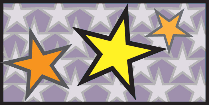
Now look at this image:
Most people agree that this is a better design. The reasons given are that the objects look like they belong together and the colors go together well. That gives us a few clues about what makes design work well. We can see that the different parts need to look like they belong together, and that the appearance and positioning of those shapes helps achieve that.
Here are some principles that can guide your design in the right direction. We're going to look at two categories: Gestalt principles, and general design principles.
Gestalt Principles
Look at this image. What do you see first?
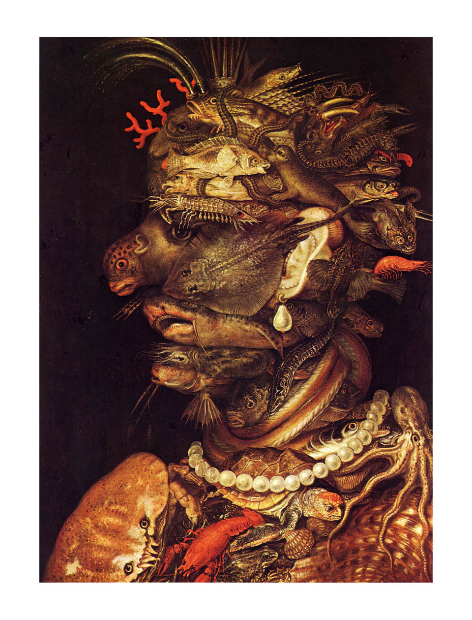
This is a painting by an Italian Baroque artist named Arcimboldo, who specialized in this kind of double image. If you saw a face in profile first, and then the individual sea creatures, you are observing an example of the principle of gestalt.
Gestalt, pronounced with a soft G, is a German word that is most often defined as "the whole is greater than the sum of its parts." Designers like this term because it provides a concise definition of good design. The goal is to arrange the elements of your medium in a way that people see the whole design and not the individual parts.
There are three central ways to achieve gestalt in your design:
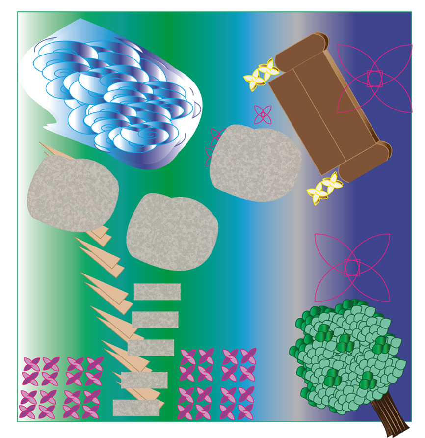
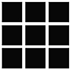
1. Proximity: The closer objects are to each other, the more likely people will perceive them as a single object composed of several parts. People will tend to see the one big square before the individual squares.
2. Similarity: The more shapes resemble each other, the more they will blend together into a single image.

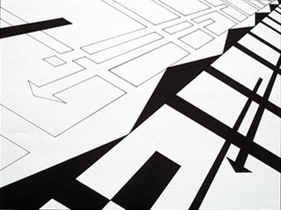
3. Continuation: Our eyes are inclined to follow lines and curves, so if objects are arranged along paths then it leads our eyes along the path, creating a sense of movement. We perceive the path more than the individual shapes.
The goal in the use of these principles is to achieve something called closure, a point at which all the parts have come together to former a larger whole. That's when we have achieved gestalt.
Now let's look at the good design shown earlier. Can you identify the three gestalt principles of proximity, similarity and continuation at work?
Other Design Principles
There are other considerations to think about in trying to make your design work. Here are a few:
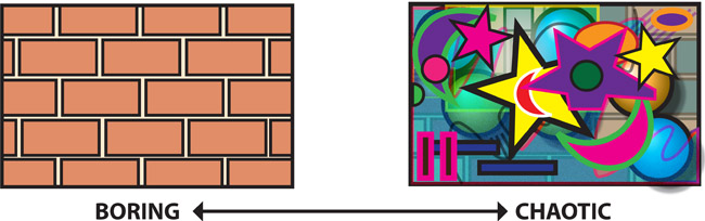
Repetition vs Variety: In the project you're going to be working on, the medium is a vector drawing program. The elements, or building blocks available to you are lines, shapes, value, color and texture. To make your design work, you have to decide what combination of these elements to use, and find a balance between too much repetition, which is boring, and too much variety, which can be chaotic.
Repetition is good, it's the gestalt principle of similarity, but variety adds interest. Try to find a balance between the two.
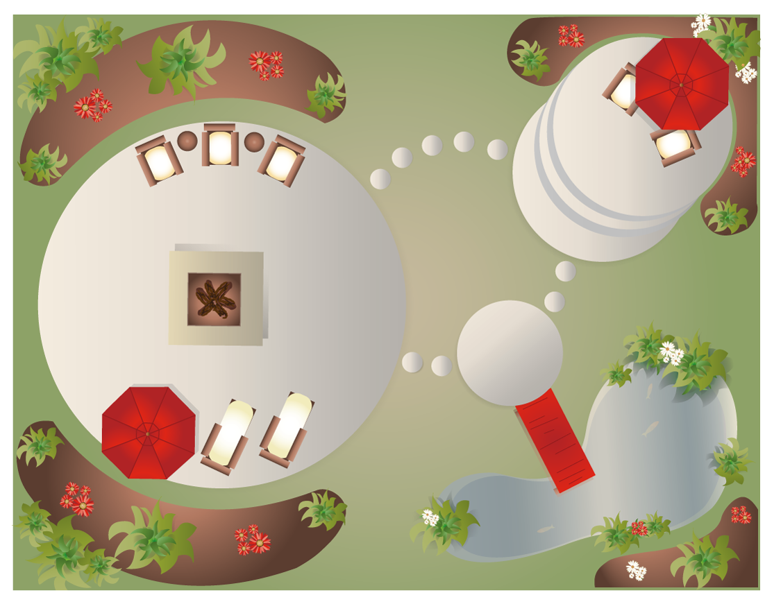
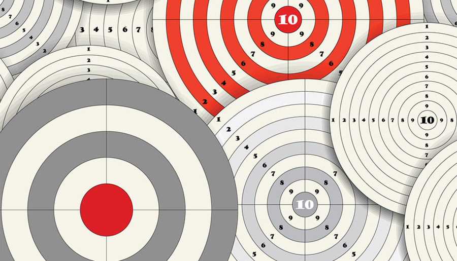
Dominance:This simply means that some shapes are going to be more noticeable than others. Make sure that the things you want to be noticed first are what stand out. This can be done through scale, color, contrast and value.
Notice how in this image the red parts are dominant. That's through color and contrast: They're the most different parts. The other areas blend together through the gestalt principle of similarity.
Balance:This is self-explanatory, but there are two ways to achieve it.
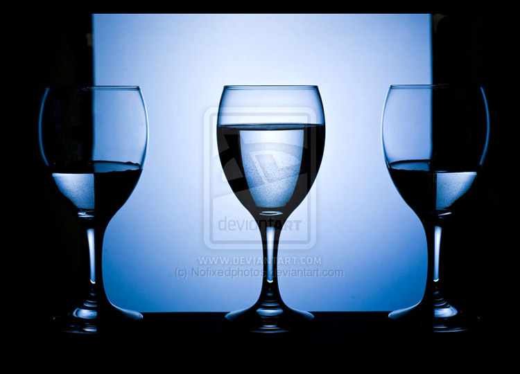
Symmetrical balance, with equal visual weight on either side of the mid-point:
Or asymmetrical balance, which can be more dynamic. This often involves elements arranged in curves or diagonals, which imply movement. Notice how the gestalt principle of continuation can be used for this:
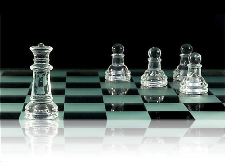

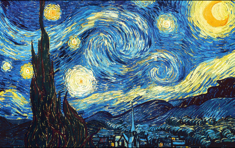
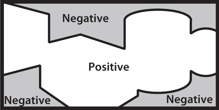
Figure-ground: It's important to keep in mind that all the areas in your frame are part of the design, even the areas with seemingly nothing in them. Also called foreground-background, or positive-negative space.
Economy: Simply put, it means don't make your design any more complicated than necessary.

It doesn't mean it has to be simple either, just only as complicated as it needs to be.
To summarize, here are the design principles you can use to make a successful design:
GESTALT
• Proximity
• Similarity
• Continuation
DESIGN PRINCIPLES
• Repetition vs variety
• Dominance
• Balance
• Figure-ground
• Economy
You also need to choose a good color palette (think about split complements), and pay attention to value and intensity. Try to have a good range of values, ie, lighter and darker areas, so that your design doesn't look too flat.
Along with everything that’s been discussed above, here are two concepts that sometimes help make a design more engaging: