


VCOM 2950 Visual Communication Applications
Instructor: Phil Loubere
Photoshop Project
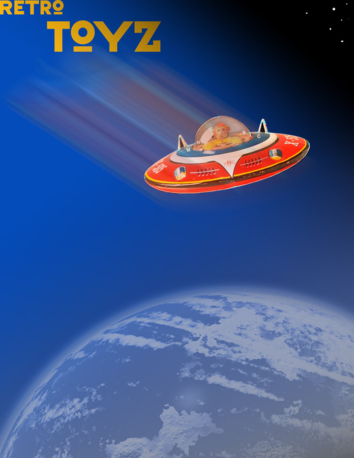
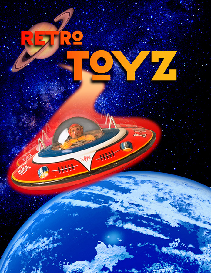
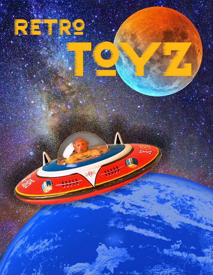
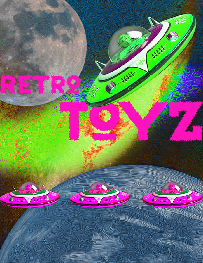
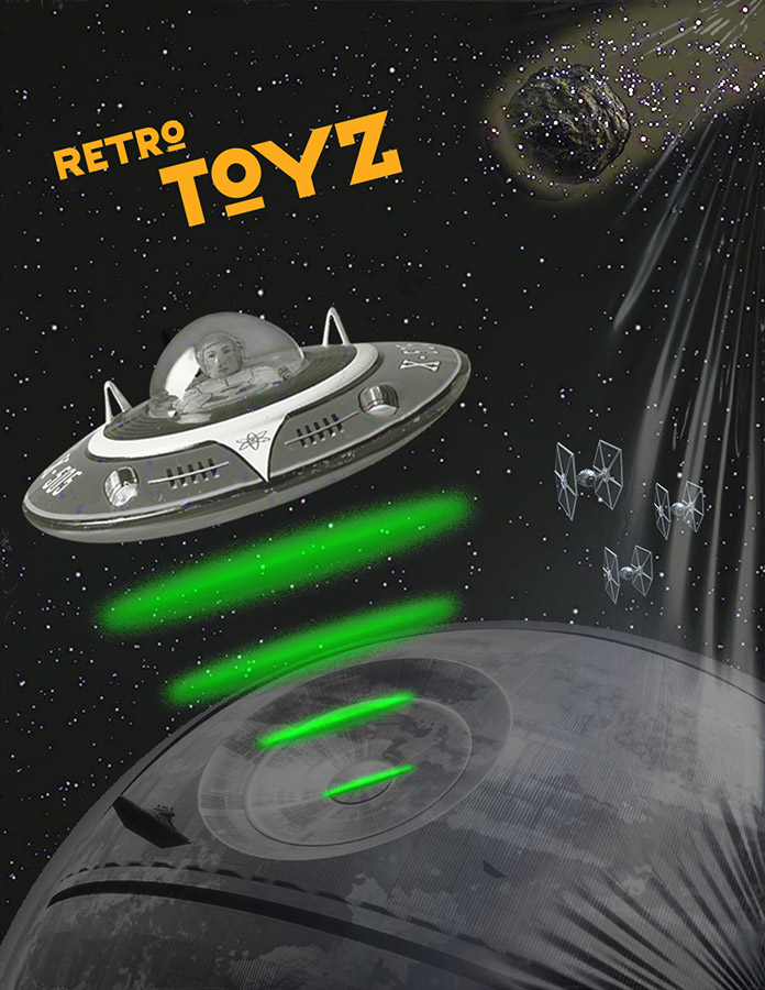
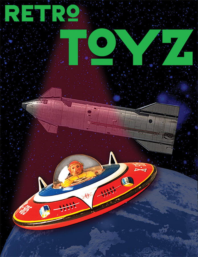
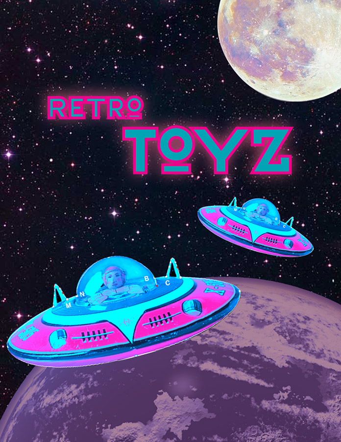
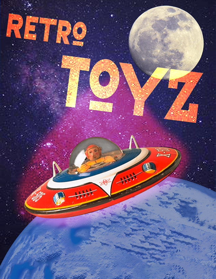
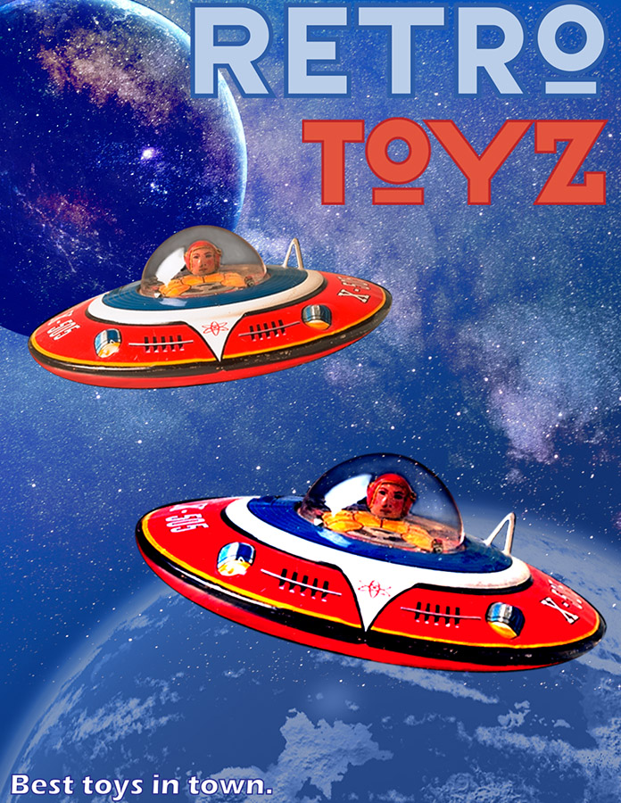
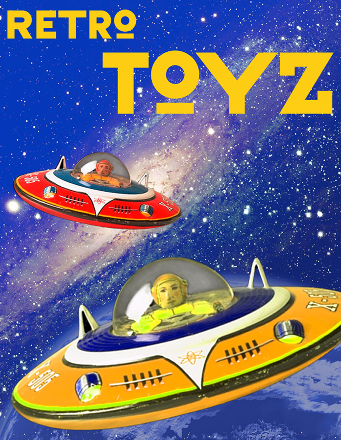
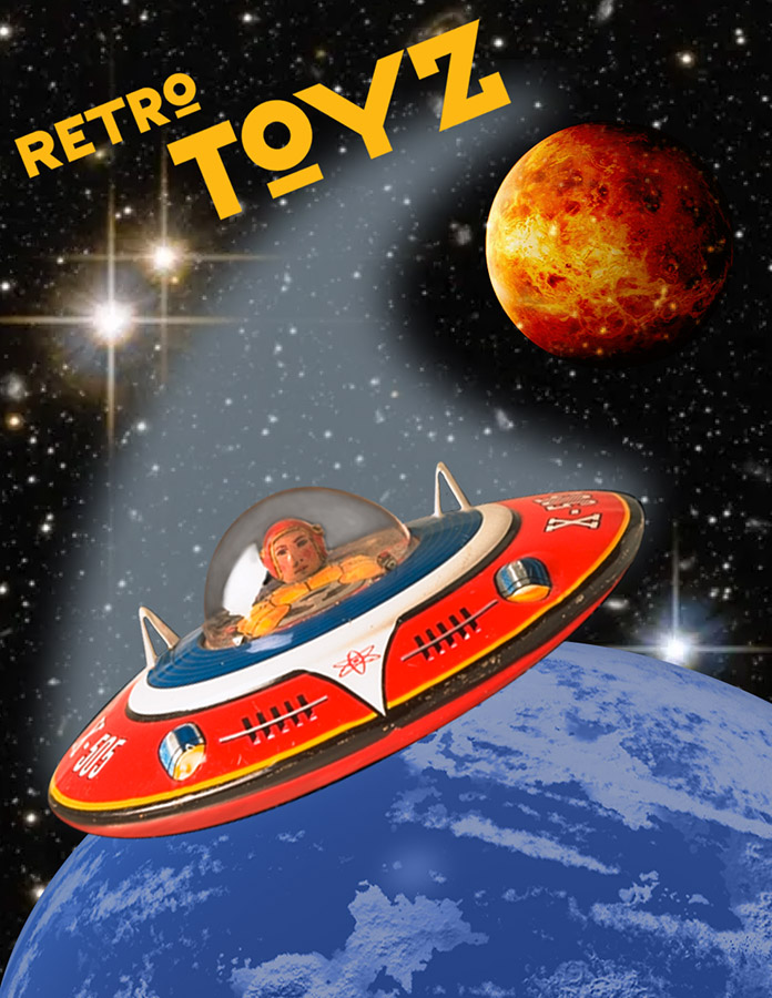
The goal, as in the Illustrator project, was to create a design that achieves a unified appearance, that is, viewers see the entire design before the individual parts, primarily by using the gestalt principles of proximity, similarity, continuation, and closure. The more general design principles are also important: dominance, balance, economy, and finding the right equilibrium between repetition and variety.
Here are everyone’s project submissions. Click on the thumbnails to enlarge them:
Section 001
Section 002
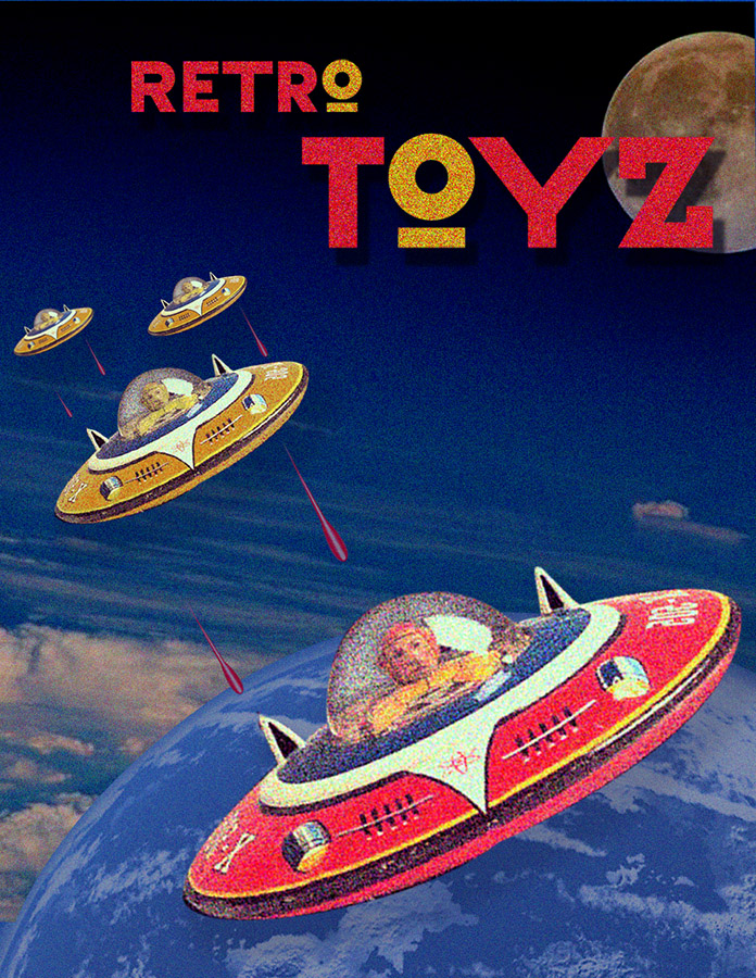
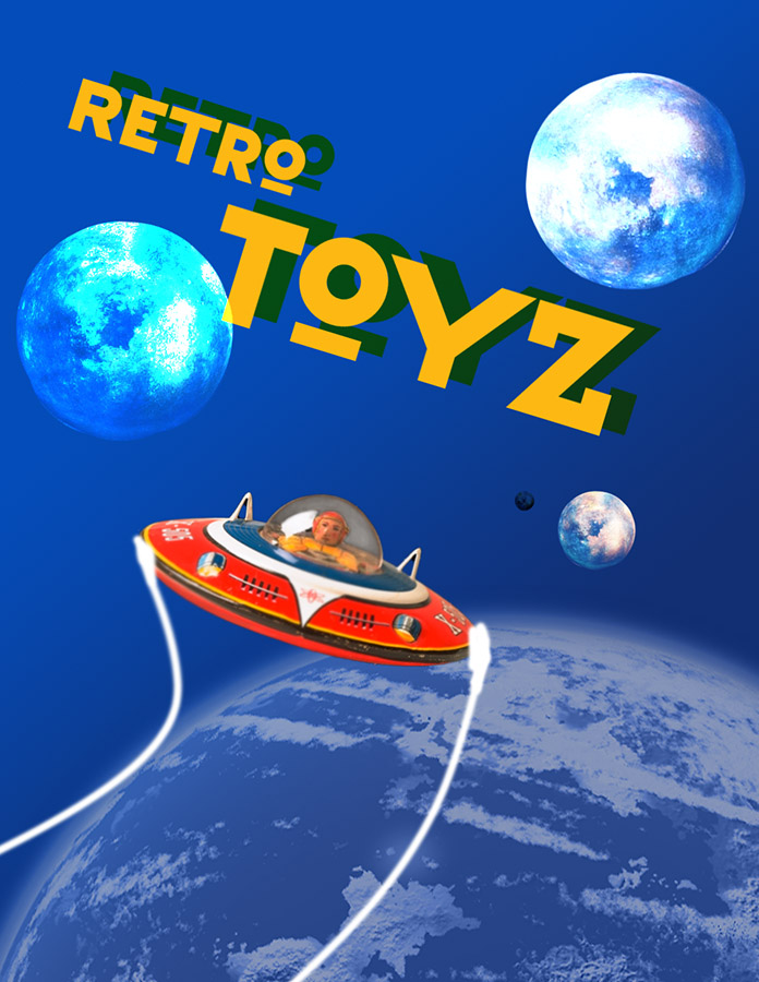
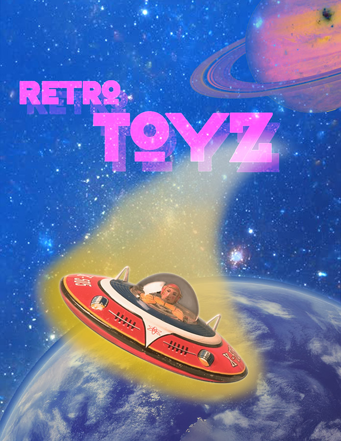
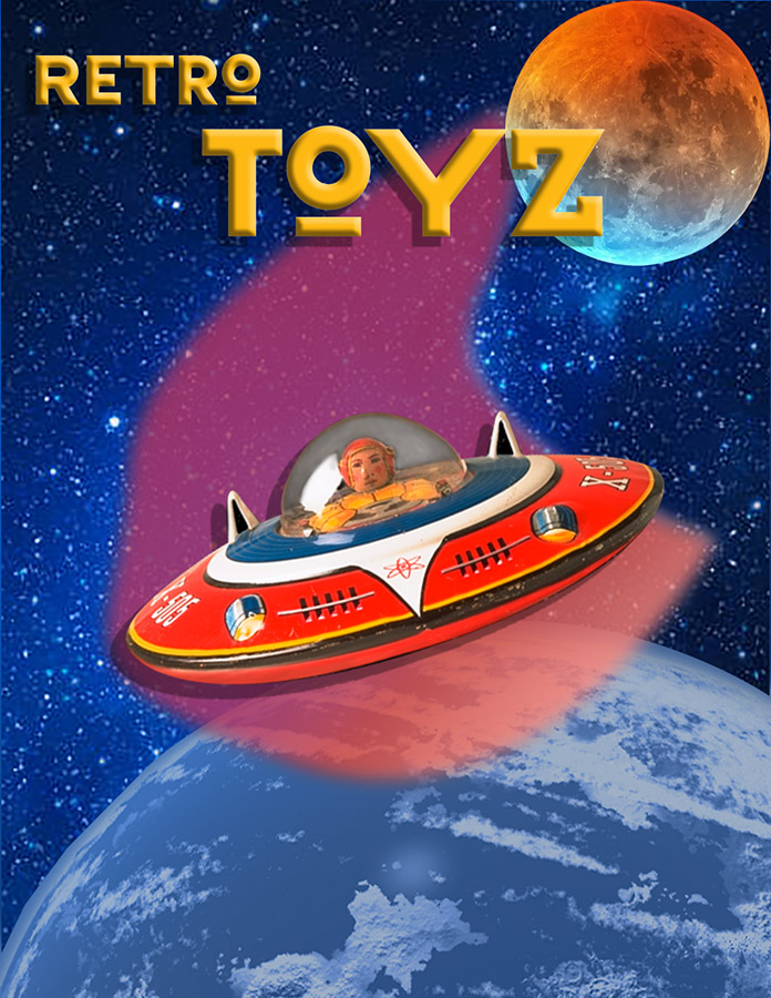
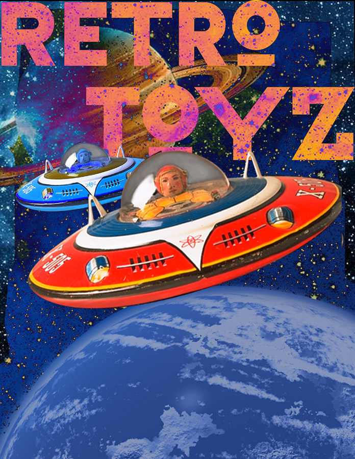
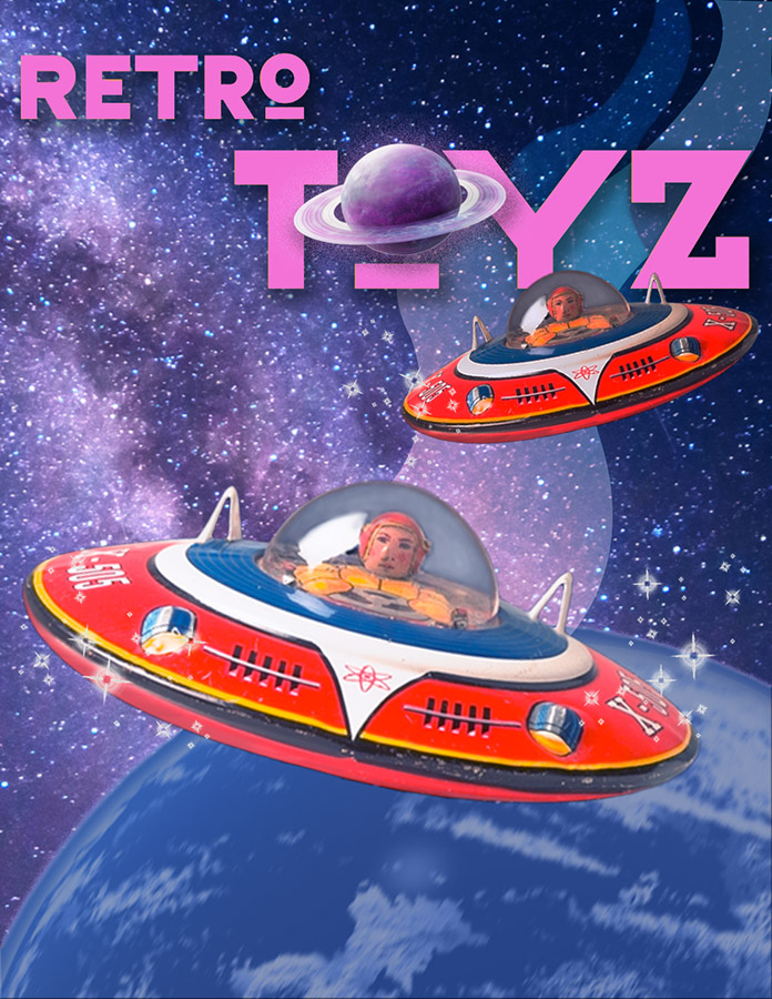
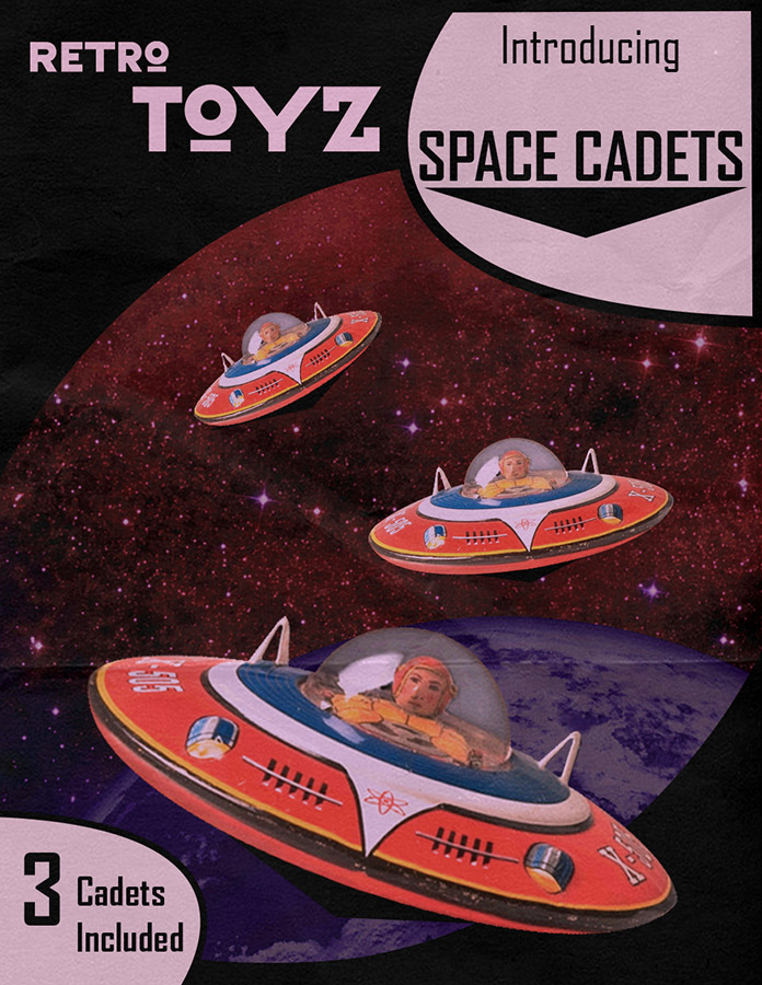
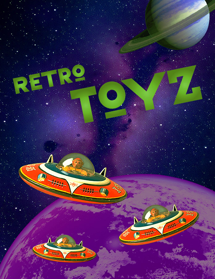
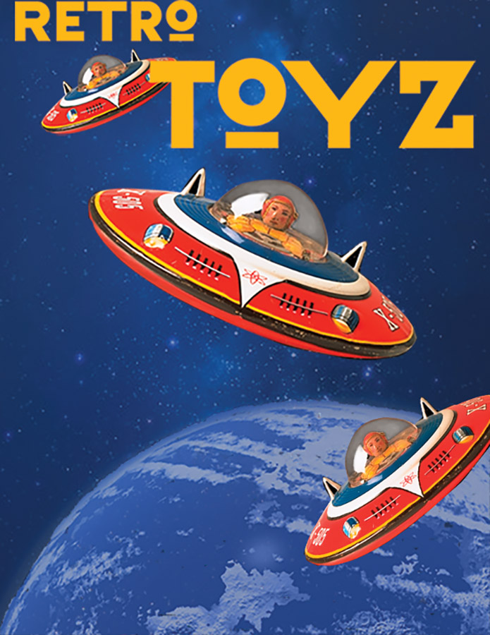
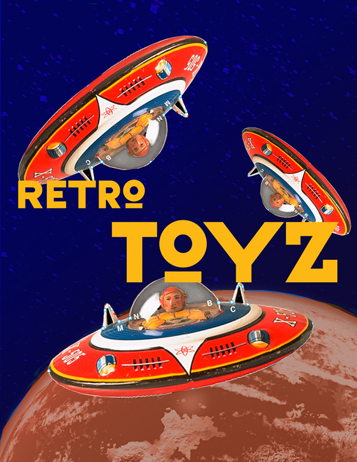
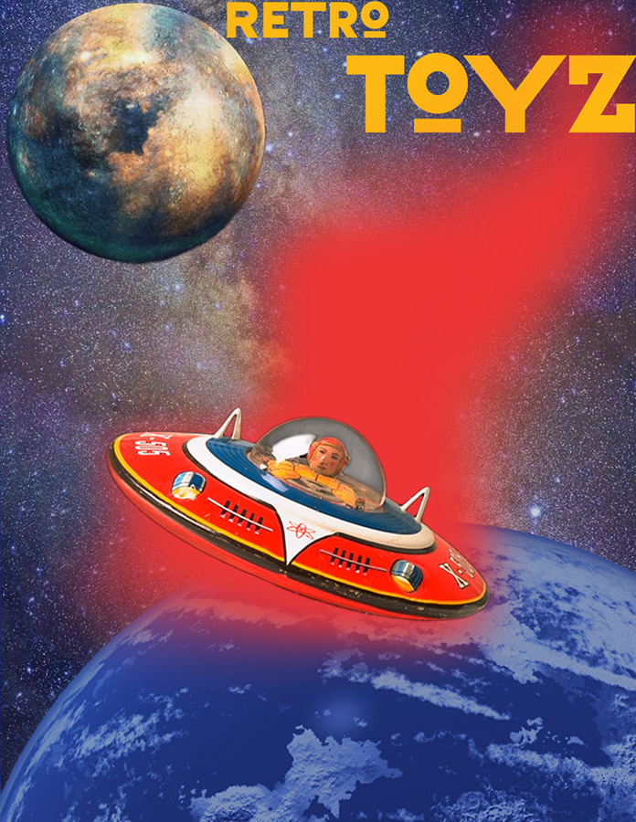
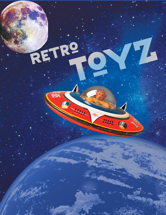
They’re arranged in alphabetic order, not by quality, so you can judge them for yourself. A key difference between this and the Illustrator project is that here you’re dealing with photographic objects as opposed to abstract shapes, and with an illusion of three-dimensional space, often referred to as plastic space, as opposed to the more decorative, that is, flatter, space of the Illustrator project. As a result, individual objects carry more visual weight, and too many of them would start looking overly crowded. It also becomes harder to make proximity groups that add up to a larger shape, as one can with the flatter vector shapes in Illustrator.
I would rate the most successful designs as those that have a well-defined focal point, that is, something that stands out first, and then the other objects recede in importance, playing supporting roles. Also, the most entertaining ones have a sense of movement, achieved through strong diagonals and curves.
Here’s a short review of the design principles involved:
Proximity: Usually the most successful designs for this project are those that use groups of shapes which combine together to suggest objects and patterns. Conversely, single shapes that are isolated from each other do not come together as well to unify the design. A simple way to achieve this is to simply have shapes overlap.
Similarity: Shapes that look alike tend to form larger groups. That is achieved through the contour and the color of the shapes.
Continuation: When shapes are arranged along implied paths, that creates a sense of movement. Diagonals and curves are generally more dynamic and add energy and interest to the design.
Repetition vs Variety: Try to find the right balance. If you have the same shapes repeated in a predictable pattern, do something unexpected, vary the spaces, leave a gap or two. You can also try to use a rhythmic pattern. On the other hand, if you have objects that don't have much in common, you probably have a problem with unity.
Dominance: What is the most attention-getting part of your design? Try to guide your viewer around the design by emphasizing the parts you want to be seen first. If your background is intense or busy, it might be distracting or competing with what should be the dominant shapes.
Balance: That’s usually not too difficult to achieve, and most people do it instinctively. But if your most dominant shapes are clustered in one part of the frame, that could cause a balance problem.